
Swarovski crystals are a pretty big deal for the women on my father's side of the family. Usually, a Swarovski item is given to a girl on a very special occasion: a sixteenth birthday, a wedding, etc. A few years ago, when I turned 18, I received a Swarovski heart-shaped keychain as a birthday gift. I was intrigued by the clean-cut appearance of both the keychain and its packaging. I loved the swan logo and the deep navy color of the box. It was little wonder to me why these items were considered such precious gifts.
Recently, I came across some magazine ads for Swarovski jewelry. I really liked it, so I decided to check out their website.
I have to admit, I was really hoping to open the web page and find lots and lots of the lovely, deep navy blue that I've always seen in the Swarovski packaging. There is no navy, but in its place is a rather pleasing combination of white and cream that give the site an overall clean, crisp look. Suitable for crystals, I think.
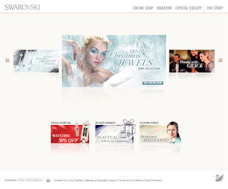
The homepage is anything but elaborate. The name "SWAROVSKI" is placed neatly in the top left corner, in a seemingly translucent and icy grey that works well with the creamy palette. I wanted to see the lovely little swan logo prominently displayed, but it only occurs at the bottom right of the homepage, grey and tucked away.
There is very little content on the homepage. There's not even an introduction to the site or the company. The first thing that caught my eye was the slideshow of pictures in the middle of the page. The pictures are a combination of advertisements for seasonal products (in this case, Christmas ornaments) and an article about accessorizing called "Dazzling with Grace". The photographs are elegant, much like the products they are trying to sell.
Immediately below this slideshow, there are 3 smaller images that are geared more towards customer service, advertising a promotion, guaranteeing prompt deliveries, and offering a telephone service. I'm glad that these images are much smaller. They don't distract from the main content (the slideshow), especially since the palette and background of the page are so simple.
The primary navigation is located in the top right corner of the site, on the same line as the name "SWAROVSKI". The font is an all-caps sans-serif, which does add to the clean look of the site, but I'm curious to see what a serif typeface would do. It might make it a little more elegant and a little less sterile. The primary navigation is grey, just like the site title, and both the rollover and selected states for each link is a darker, more opaque grey. The primary navigation is consistent throughout the site, and you can get back to the homepage by clicking on "SWAROVSKI".
Swarovski makes a large number of different kinds of products, so one thing that is quite helpful about the primary navigation is the fact that, if you mouse over "Online Shop", a drop down menu appears, giving you the option to explore the products by category (example: jewelry) or collection (example: Disney). This is particularly helpful for someone who is new to the site, since the homepage itself is not very explicit when it comes to describing the company's products.
One of the primary navigation links that is a bit unclear to me is "Magazine". Clicking on it revealed a collection of articles, but I'm still not sure if these are articles from a Swarovski-specific magazine or just a collection of articles written for customers. In any case, the articles are beautifully laid out with very elegant serif typography, which makes for an easy read. They are also punctuated with several clear, attractive pictures, which always gets a thumbs up from me.
The exclusivity that I've always associated with Swarovski is emphasized by the "Crystal Society" link in the primary navigation. The drop down menu lists topics of interest for society members, with words like "Exclusive". I have no idea what most of these topics mean, but perhaps that's the point. If you're a member, you'd know.
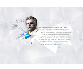
My favorite part of the site is by far the page that opens when you click "The Story" in the primary navigation. It opens a beautiful, animated timeline that looks like a string of crystals. It moves as you click and pull with your mouse or click on the arrows at the left and right sides of the page, and when you reach a large cluster of crystals, a short description of the significant events at that point in Swarovski's history pops up when you mouse over the cluster, and then disappears just as smoothly as you move your mouse away. The background of the timeline looks like you're looking straight into a crystal. It's absolutely stunning in my opinion.
In the "Online Shop" section of the site, the products are organized in rows much like products are displayed on sites like Amazon. It may not be a particularly innovative way to display products, but it's clear and concise, and frankly that's all I need when I'm shopping for something online.
Despite the lack of the oh-so-lovely navy, I really enjoyed browsing this site.
www.swarovski.com


No comments:
Post a Comment