
There's a lot of controversy surrounding the Product (RED) campaign. At least, that's the vibe I get on Penn's campus, but I've found a lot of students here to be pretty suspicious and cynical about most things like this. Product (RED) was started as an effort to fund AIDS treatment and prevention in Africa, and it's been going strong for the past 2 years. I bought a (RED) shirt from The Gap when the campaign first kicked off. To be honest, I probably would have bought the shirt even if it had nothing to do with Africa, because I was, and still am, absolutely NUTS about the logotype. I don't think I ever felt so passionate about a design that involved little more than an all-caps sans serif typeface.
What amazes me is that after 2 years, the aesthetics of the campaign have remained almost entirely the same, even though the range of the campaign has expanded. The questions I keep hearing are always about whether or not the money that the campaign collects actually goes to the cause that it claims to support. Seeking some clarity, I visited the Product (RED) website.
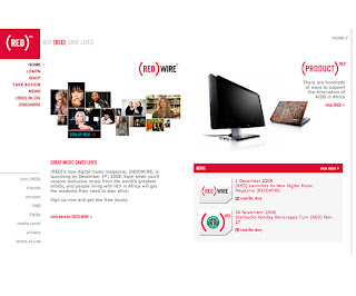
Despite how large the campaign is (involving 9 major companies), the website is amazingly simple and clear, conveying the central message of eliminating AIDS in Africa.
The site is full of what I believe is flash animation involving mostly text, all in the same all-caps sans serif as the logotype. The primary colors of the site are red, white, grey and black, the only exceptions being color photographs.
The homepage is like a preview of some of the sites contents. It features a short introduction to (RED) WIRE, a new digital music magazine. There are rotating images of various (RED) products, and news section enclosed in a red frame in the lower right corner. The news section features links to the 2 most recent news stories, with the option to view more.
The primary navigation is arranged vertically underneath the logo in the upper left corner. The links are the same red as the logo, with darker red overstates. The links themselves are easy to understand. While there is a lot of information on the site, it is conveyed with clear, concise text and clean images that are placed on a white background.
In contrast to the clean organization to the site, I noticed something rather confusing and clunky about the navigation. Clicking on a primary navigation link opens the secondary navigation underneath that link. The secondary navigation is light grey and easily distinguishable from the primary navigation. However, opening this secondary navigation causes all of the navigation underneath it to shift downwards to accommodate the secondary navigation. As a result, it takes a few seconds to reorient oneself to the new navigation arrangement. I feel like there should be some way to display the secondary navigation without causing everything else to shift.
I really like the way that the information is presented on the site. Each time a link is opened, it gives an introduction to whatever the topic is, followed by an option to "view more". I find this much more effective and less overwhelming than trying to organize all of the information on the very first page. It allows the user to decide what they'd like to see and learn more about.
www.joinred.com


No comments:
Post a Comment