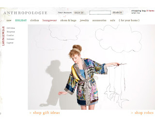

My recent and frantic job search led me to the official site of the clothing/lifestyle store Anthropologie. I walk by their store near Rittenhouse Square very often, and the store windows always intrigue me with their crafty ensembles and bright colors. I regret to say that my starving-artist budget prevents me from doing any shopping there, but I have wandered through the store nonetheless. Everything about Anthropologie seems like it was done with the guidance of artists, from the catalogue down to the arrangement of the clothing racks.
What I really love about Anthropologie's website is the fact that it is incrediby simple in its design - there's relatively little content on any given page - and yet it still manages to be anything but sterile. I studied the site for some time to figure out why, and I came to the conclusion that the delicate combination of script and serif fonts (Filosofia, perhaps?), simple photography and line-drawings, and the black-text-on-white theme allow the site to maintain an artistic, rustic, and cosy feeling without having to overload the pages. In a word, I find it stunning.
The homepage features the name ANTHROPOLOGIE in delicate grey all-caps at the top left, and this remains constant on every page on the site. Behind the name, the white background is accented subtly with a delicate lacy pattern, mostly grey with small flashes of red. The content area of the homepage highlights particular products with shortcuts that take the user to the page where they can purchase them. The highlighted products appear to be seasonal (right now I see Christmas decorations). The shortcut links are in bright red with little arrow icons which makes them very easy to point out. The photographs of the products are also very simple, since the items are shown against the white background of the page, rather than being worn by models, etc.
The elements of the primary navigation are a testament to the broad range of products that Anthropologie offers (clothes, shoes & bags, loungewear, jewelry, accessories, and home decor). The primary navigation categories are very clear. They are not very large, but being on a white background makes them easy to distinguish. They are also very well spaced. The text is olive-green in color, and rolling over them changes them to a complementary deep red and also reveals a drop down menu that lists the different sub-categories of each type of product (for example, rolling over "Jewelry" reveals a drop down menu with "gift ideas", "necklaces", "earrings", "bracelets", "rings" and "jewelry boxes"). Not only does this give a clear idea of what the user can expect to see when they click on each primary navigation link, it can also allow them to access the products they are looking for faster, by clicking on one of the sub-categories in the drop down menu.
There are two primary navigation links that stand out. Right now, there is a link called "HOLIDAY" that is in all-caps and a bright green. Appropriate, I'd think, especially since Anthropologie's products are often given as gifts. The sub-categories of "HOLIDAY" are clear, except for "Sugar and Spice", which, I discovered, leads to the company's collection of scented items like soaps and candles. The other primary navigation link that stands out is "For Your Home" which is surrounded by brackets. Clicking on it takes you to the section of the site that is devoted exclusively to home items. In this section, there is a primary navigation link in brackets called "For Your Self" which takes you back to the homepage. The distinction between the home decor and clothing sections makes it easier to navigate through the different types of products Anthropologie sells.
Each page on the site has a similar template: the primary navigation stays the same and on the left side is the secondary navigation (which is the same set of sub-categories that appear in the drop down menu when you roll over the primary navigation links). Clicking on the a primary navigation link (Example: Loungewear) defaults to a page with a photograph of some examples of the products in that category (Example: a model wearing a bathrobe). The photos are very simple with neutral backgrounds. Clicking on one of the secondary navigation links takes you to the products themselves, which are each framed with a simple gray line. Simple, yet clear. The user has the option to have 8, 16 or 32 items displayed per page. The pagination is also very clear, and is located both above and below the products. For many of the secondary navigation links, clicking on them reveals more sub-categories as tertiary navigation, which further sorts the many products featured on the site.
At the bottom of each page, there is an opportunity for users to sign up to receive emails from Anthropologie, as well as links that are associated with the company but not necessarily with products for sale (store locations, privacy and security, etc).
In summary, I am really impressed with this site. The simple yet non-sterile aesthetic is something I am always aiming to achieve in my graphic and website design, so it's really great to see a successful example. I gave a lot of thought to how I would improve this site if I could, and to be honest, I still can't think of anything.
www.anthropologie.com


No comments:
Post a Comment