
I really love Real Simple magazine, not only for its content (which lives up to the magazine's title), but for its design as well. It manages to be clean and yet anything but sterile. The colors are bright and expertly coordinated. Recently, they have used clever photographs of paper models of objects like a vase of flowers, etc., to designate the different sections of the magazine. I was curious to see whether the magazine's official site echoes these aesthetics.
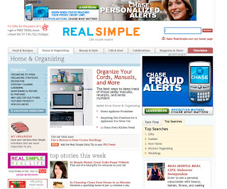
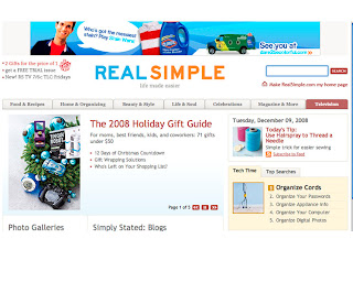
What surprised me when I reached the homepage was the lack of color. Apart from the blue and orange 'REAL SIMPLE' heading, pretty much everything is displayed in shades of white and grey. What's disappointing is that the ads are the most vibrant thing on the page. That, and the fact that they are given a surprisingly large amount of space, washes out the actual content of the homepage. Even the huge 'REAL SIMPLE' at the top of the page is dwarfed by the enormous banner ad above it.
The primary navigation would be virtually undetectable if it were placed in any other location except at the top of the page. The text is small, grey-on-grey, with a pastel yellow overstate that is, like everything else, drowned by the ads. One redeeming aspect is that the categories are very clear: 'Food & Recipes', 'Beauty & Style' and so on. The 'Television' category stands out in a muted shade of red, but, even as a regular reader of the magazine, I have no idea why. I click on it and it opens a page devoted to the new Real Simple TV show on TLC. The Television page is just as drab as the homepage.
In fact, all of the pages are just as drab as the homepage, and, with the exception of the Television page, they are all organized in the same grid. And it's the same aesthetic situation on every page as well-several sections of content with a hierarchy that is not very well defined, and at the same time drowned out by annoying ads. It takes a lot more reading than I would like to do to sort through the content on each page. When opened, the individual article pages are simply laid out, but I feel like the ads and navigation take up much too much space on the page. It feels like it takes me a few seconds to determine where the article actually is.
Like the magazine, the photographs that accompany the site's content look very professional and beautiful, but they are so small that I feel like so many of their good qualities are lost.
If I had the opportunity to redo this site, I'd probably keep the content layout pretty similar to the way it currently is, but I'd give each page a total color makeover, choosing a different (but coordinating) color palette for each section. I'd also remove several of the ads and make the remaining ones much smaller. I'd make the primary navigation slightly larger and up the contrast so it's much easier to spot on opening the homepage.
After all, shouldn't the official site for 'Real Simple' be...simple?
www.realsimple.com


No comments:
Post a Comment