
I've been using more and more Aveeno products lately. As a sucker for beautiful packaging design, I have to be mindful that I don't purchase a product just because it looks pretty (a costly mistake I have made one too many times). The great thing about Aveeno is that I'm really happy with the products themselves AND I get to gaze adoringly at the packaging.
In search of a more effective skincare regimen, I decided to consult the official Aveeno website for a comprehensive look at their products and what one can expect from them. I found that, and on top of it, a really beautifully designed site.
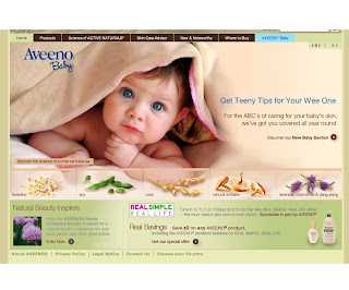
The site opens to the homepage, with a pleasing color palette that looks like it's inspired by flax and wheat (appropriate, since wheat is a common image used on the Aveeno packaging). Two thirds of the page is occupied by a slideshow of images featuring certain products, with pictures of beautiful, smiling women with radiant skin and blue-eyed babies, also with radiant skin. (Oooh, I want radiant skin like that!) The bright colors in the pictures complement the neutral color palette nicely. Another source of bright color are the small images of Aveeno's natural ingredients at the bottom of the slideshow (lavender, soy, etc.) When you roll over these images, they pop up slightly to indicate that they are clickable, and clicking on them opens a larger box within the slideshow area with a more in-depth explanation of the ingredient and it's uses. It has the feel of an old-fashioned apothecary, which I really like.
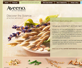
The primary navigation is located at the very top of the page. The dark brown color of the navigation bar allows it to stand out without overpowering the rest of the page. The links in the primary navigation are very easy to understand and they remain consistent from page to page. There is no rollover state, but, once selected, the link is highlighted with a light green color, so you always know which page you're on. The "Aveeno Baby" link is the last in the horizontal row, and it stands out because it's surrounded by light baby blue rather than dark brown. Appropriate, since Aveeno has an entirely separate line of products intended for babies. Since the "Home" link is present in the primary navigation on all of the pages, it is very easy to navigate back to the homepage.
One thing that I really like about the primary navigation is the "Products" link. When you click on it, rather than immediately redirecting you to a new page, it opens a drop down menu with the different product categories, and the sub-categories of those types of products (example: The category of "Lip Care" in the drop down menu has the sub-categories of "Lip Conditioners" and "Cold Sore Products".) I think this is a really effective organizational tool, and makes the site all the more user-friendly.
Another thing that's nice about the homepage is the fact that ads and promotions are distinctly secondary to the products themselves. For example, a "Special Offer" promotion banner is located under the picture slideshow, but it blends in with the rest of the site.
What I noticed as I clicked from page to page is that, despite the fact that the content layout changes from one page to the next, the aesthetics remain very consistent, so the entire site is very unified and streamlined. A beautiful close-up photograph of a bundle of soybeans, wheat, and lavender is used on most of the pages, but it changes subtly in size and position. On the pages with secondary navigation, there is a clear distinction between primary and secondary in both size and color, but the layout makes the secondary navigation very easy to spot (horizontal and parallel to the primary, separated from primary by an image).
I clicked on the "Aveeno Baby" link and I liked that, even though the primary navigation stayed the same, the aesthetics of the rest of the page were slightly different and more in tune with a "baby" feel. The palette was still neutral, but it was lightened, and a stripe pattern (like nursery wallpaper) was used instead of the picture of wheat, soy, and lavender. The idea of same brand, different product line was made very clear.
Overall, the aesthetics of this site really mirror the "natural" and "simple" identity of Aveeno, as does the site's clarity and usability. I can only think of one (somewhat trivial) change I would make. Since Aveeno makes a lot of moisturizing products, I would imagine that they are in higher demand during the winter. I probably would have tried to recognize the current season in the site, since all of the current pictures look very summery. Again, it's pretty trivial, but I think it could be interesting.
www.aveeno.com


No comments:
Post a Comment