
This summer, I applied for a job at a small store called Fabulous Stationery. The concept of the store is very unique: customers can choose from a collection of hundreds of card designs to create sets of personalized note cards and invitations. The store itself is about the size of a walk-in closet, since all the customers do is come in, choose the design and colors they like from the design binders and then place an order with the store attendant for what they want the cards to have printed on them.
When I was researching the position online, the store's website actually had me thinking that it was a much larger store than it actually is. I think this is because of the huge variety of types of cards and patterns available. The purpose of the site is to give potential customers a thorough idea of the designs that are available, so all of the card types are organized into categories on the site.
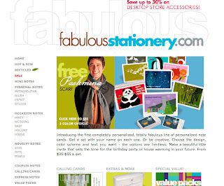
The homepage of the site lists these categories in two ways. There is a list of the categories organized vertically along the left side of the page. The different card types are also presented with small images of examples of the cards in the center of the page. I'm not sure why the two methods are used, but it does make it easy to get an idea of what's available.
The name "FABULOUS STATIONERY" takes up a large portion of the top of the page. In my opinion, it's a bit too large. If it were smaller, all of the primary navigation could be seen without scrolling. The designs of the cards are all very clean, using blocks of bright colors. I suppose the best way to describe them is "modern". They remind me of the designs IKEA uses for their products, clean and bright. It's appropriate, therefore that the font used for the site title and subsequent headings is a clean sans-serif, in bright flat colors.
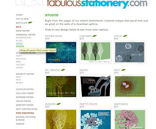
Clicking on one of the card categories on the homepage immediately directs you to a page that displays all of the designs available in that category. At the top, there is a short explanation of the particular card category. Each card design is shown as a small image of the entire front of the card. The price of the design is also clearly listed. When I first visited the site, I found myself scanning almost all of the categories because it was so easy to see the different designs. The colors on the site are so vivid and attractive that I really wanted to purchase some cards for myself.
In the primary navigation along the left edge of the page, there is a link that says "CREATE". In this page, there is a clear list of instructions for ordering personalized cards, with the option to order online rather than going to the store.
The clean, sophisticated and yet friendly layout of the sites is in tune with the designs of the cards, and appeals, in my opinion, to a primarily female audience.
www.fabulousstationery.com


No comments:
Post a Comment