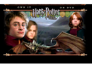

Several years ago, when the first Harry Potter movie was about to be released, I remember discovering the official Harry Potter website and being awestruck. Perhaps the fact that I was crazy about the book series played a role, but there’s no doubt that the site was incredibly interactive. The creators did a great job of appealing to young Potter fans, allowing them to immerse themselves in the literary world, find their “perfect Wizard’s wand”, be sorted into a college house by the Sorting Hat, and explore the Hogwarts School of Witchcraft and Wizardry through games.
Feeling nostalgic, I recently revisited HarryPotter.warnerbros.com. Five Harry Potter movies have been released since the last time I was at this site, so I wasn’t surprised to see a totally different interface.
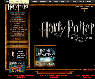
The current homepage is now basically a list of links for the site rather than the artistic façade that it used to be, with little animations popping up as I moved my mouse around. On the left there is a navigation bar with 9 links to all of the interactive features of the old site. However, despite being familiar with the old features, I still find the link names confusing, and surprisingly small. When I hover over a link, it becomes highlighted by two blue arrows that point to it, and the motion is accompanied by a whooshing sound. Practical? Nope. Aesthetically pleasing? Not entirely. Magical? I wanted it to be.
There are other navigation systems on the homepage, mainly advertisements for merchandise. Where it gets confusing is the separate navigation bar across the top of the screen. This contains links for Warner Bros. Studios in general, but it is not easy to tell this from looking at the Harry Potter homepage. I learned this the hard way, when I clicked one of the links and was taken to an entirely new site with no apparent way to get back to HarryPotter.warnerbros.com.
Speaking of getting back to the homepage, this was actually a problem when I clicked on some of the links within the Harry Potter site. If there was a link that would take me back to the homepage, it was very hard to find, and it made it difficult for me to tell where I was within the architecture of the site. The structure of the pages is anything but consistent, which ends up being more annoying than refreshing when you’re trying to navigate your way around the site, especially with so many pages.
The site seems to use primarily the same font throughout in varying sizes and weights to distinguish headlines from body text. The font is pretty in my opinion. It’s a serif, all-caps font with an angular quality that mimics the signature “lightening bolt scar” that Harry Potter bears on his forehead. However, the font is difficult to read at a small size, and I think using a sans-serif for the body text would have been wiser.
I think the site, and especially the homepage, would benefit from more images. The homepage seems overrun by text, and even the focal point is nothing more than an enlarged title of the upcoming Harry Potter film.
I do like the color palette of the site, which is a pretty consistent combination of a black background, gold, gothic-like frame images for the borders, and a deep red for some of the link backgrounds. I think these colors were chosen to tie in with the rich, gothic imagery in the books, as well as Harry’s college house, whose colors are red and gold. However, since pretty much all of the text, including the headlines, is in gold, it becomes difficult to use the color palette to separate the contents of any given page.
One pet peeve about this site that I have to mention is the fact that several of the links appear to work only intermittently, or they are completely inactive. In some cases, a page will only partially load on my browser. I have a fast internet connection and a very recent version of Safari, so this usually isn’t a problem for me.
I think the objective purpose of this site is to advertise the Harry Potter franchise by creating a site with enough interactive activities to attract an audience of primarily children and young adults, and encourage them to see the films and purchase the merchandise. I don’t know if the homepage allows you to search for anything because, alas, it seems to have randomly decided to no longer fully load in my browser. Nothing about this site is particularly useful except the Maurauder’s Map link in the top right of the homepage, which, I find, is the best way to navigate around all of the site sections.


No comments:
Post a Comment