
Maoz is a vegetarian felafel restaurant that has locations all over the world, including Philadelphia. As a diehard vegetarian-turned-vegan, the relatively new Philadelphia branches are now among my favorite places to eat. A while ago, I needed to find the business hours for one of the branches, and I came across the official Maoz website, which is just about as simple and delicious as the food.
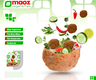
The splash page allows you to choose either the USA or World Site. Clicking on the USA Site button takes you to the homepage, which opens with the literal “unfolding” of the navigation and layout. An animated felafel sandwich drops into the screen, and out of it sprays yummy-looking vegetables and felafel, and then the animation freezes.
There are 4 elements in the primary navigation, which is clearly distinguishable, aligned vertically, and placed on the left side of the page. When you roll over the first navigation link, “Maoz Vegetarian”, 4 secondary navigation buttons pop up (literally) under it. The first 2 are clear: “About Us” and “History”, but the other 2 are more vague. Upon exploration, I find that “World of Maoz” takes you to a collection of articles written about the restaurant and a list of customer reviews. “Love Maoz” gives you the opportunity to view Facebook, Flickr, and Myspace pages devoted to Maoz.
The rest of the primary navigation is pretty straightforward. “The Maoz Menu” shows you exactly that (complete with dancing vegetables and happy people eating felafel), “The Restaurants” offers you locations and some information on the concept behind them, and finally, “Contact Us” allows you to leave comments and even get look into working for the franchise.
The site manages to be incredibly simple and yet not at all bland. The color palette is primarily a bright, spring green that looks very clean and healthy. The other two colors are a bright red and white. The red contrasts nicely with the green. The Maoz logo features a green graphic in the shape of a leaf, and this same shape is repeated in the site background and referenced in the shape of the primary navigation buttons.
It seems like the site is designed to be as informative as possible for people who are not familiar with the restaurant, and its simplicity is very effective. The clean graphics and crisp images will appeal to health-conscious customers. The transparency of the information (full menu, list of ingredients, etc) goes well with the simple layout of the site.
All in all, the site manages to be cute without being overly corny, and it paints a pretty accurate picture of what the restaurant and the food are actually like-clean, simple, fresh, and delicious.

